I have now finished my piece and would like to sum up the process I took to get where I am now (17 attempts later). I first sketched out about 4 ideas in a book (now lost so unable to scan pictures in) Then went into illustrator to start some initial designs (see first 4 attempts below.) The first (circled confused around 4 question marks) I really liked I belived it was creative and original however due to it being to “confusing” to read decided not to use this option and try another from my sketches. The second attempt (individual letters spread around page with arrows linking them together) was again too confusing and just looked to random as if they where just placed anywhere creating no logical order however I did like the use of arrows almost monopoly style. To create more order to this style I tried a third attempt (sets of letters in line with arrows) this was easier to read however was very plain and in order I wanted it to have a little more confusion. The fourth attempt was an evolution of the third taking its good point but improving them I angled the letters and I believed that it worked a lot better giving it a more stylized feel. All the attempts however lacked typography which I wanted to add in after as I believed just the lay out should give the impression of “confused” I played with different type fonts downloaded from “Dafont” however none felt right and I lost confidence in the piece so I scrapped the ideas and started again.


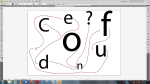


The last set of ideas I did are below. The idea was to take a font this I felt look how confused should look then place in an obvious order that people would have to look at for more than 2 secs to understand. The first attempt (jus the letters not question mark) was the main idea that the rest was based of. The second (letters with question mark not rotated) was going back and using the question mark to add a bit more punch to the piece and fill in the giant gap. The last one which is my final piece was taking ideas back from when I rotated a previous idea just making people work that little bit harder. Overall I am happy I believe the font works really well giving it a nice effect that gives the reader something to pull them in the angled letters and various size help creates the confused feel and question mark gives it an edge and the question mark is the biggest object and sums ups confusion really well.


